Merchant Order Management System
Notes 03: Order Details Layout


"Great design is not what you add. It's what you dare to remove."
Overview
Startups ship fast. Two dev teams, building in parallel, each handling different order types — and over time, the Order Details page quietly fractured into multiple layouts with no shared structure.
Same page name. Completely different experience depending on which order a merchant opens.
The result: merchants pause, scan, and search for information that should already be obvious.
→ Cognitive load increases
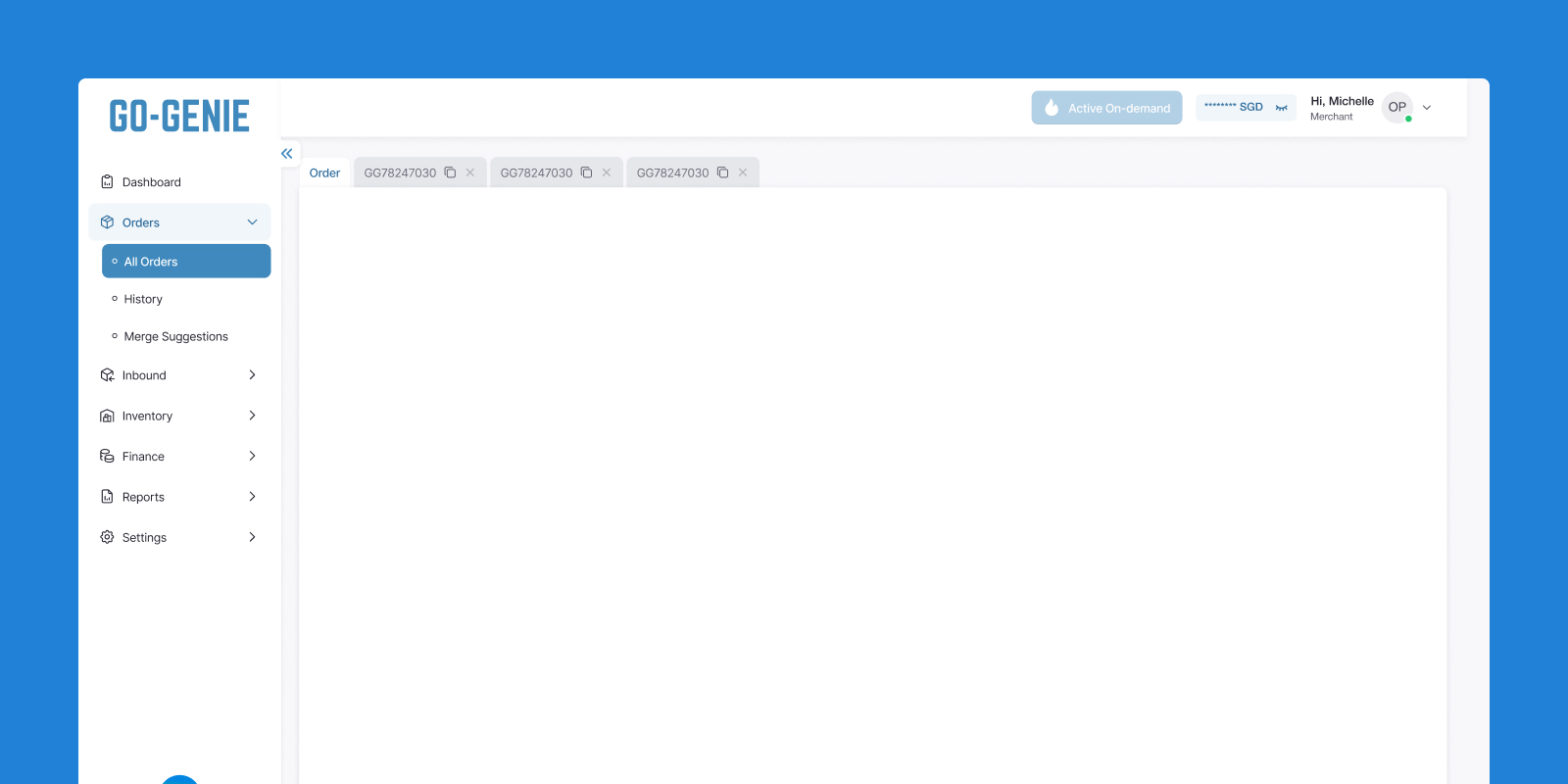
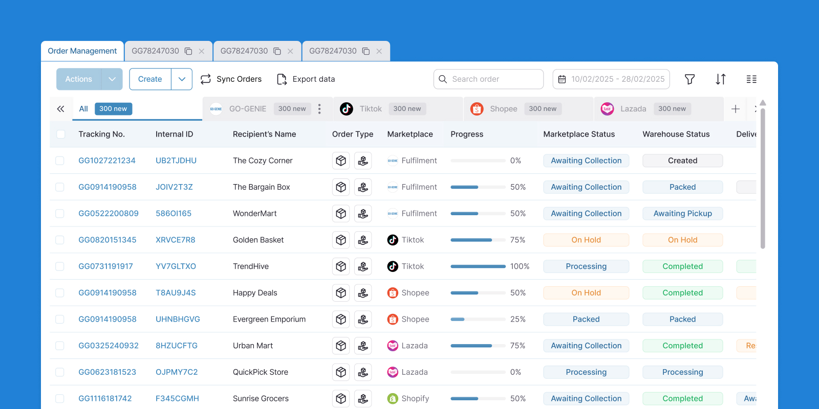
Here's a look at each layout, and why the differences matter.
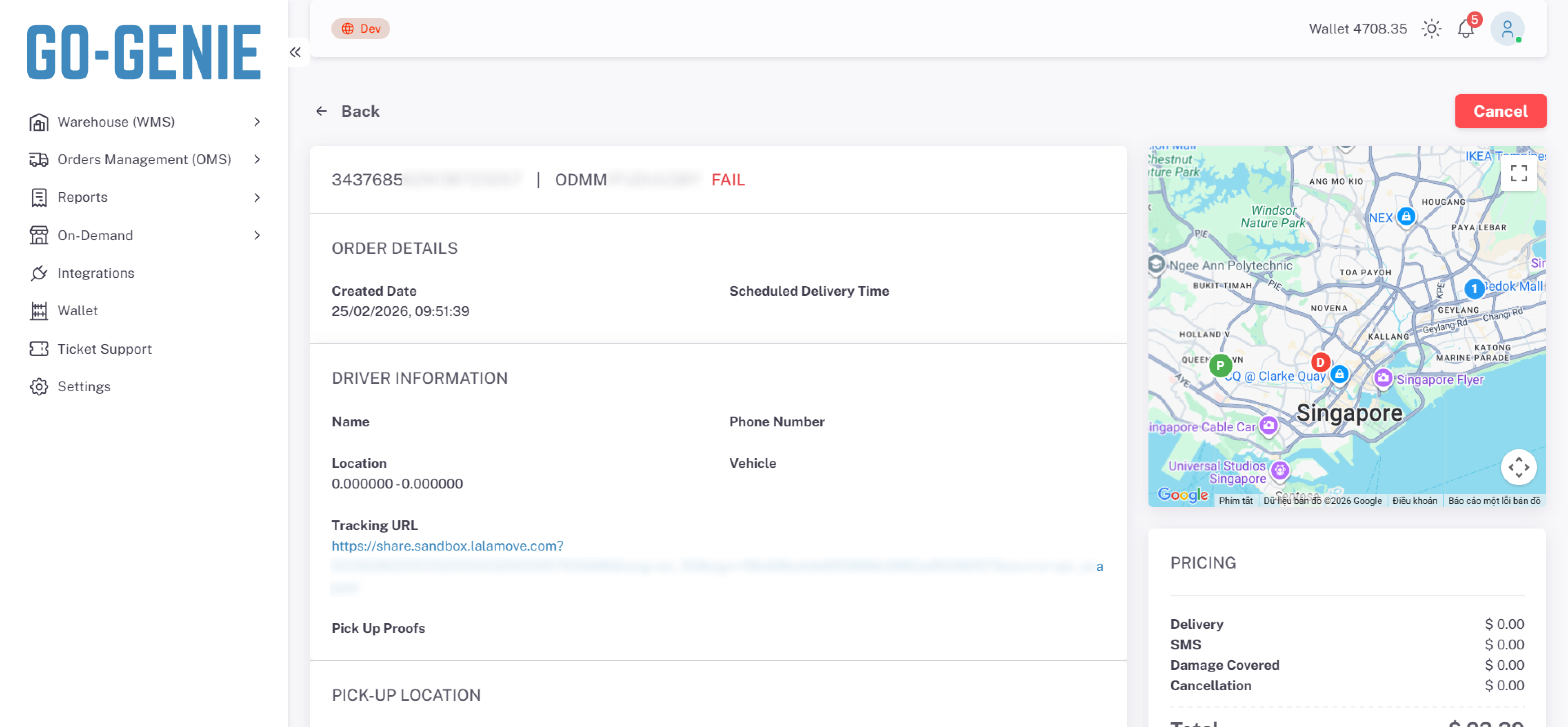

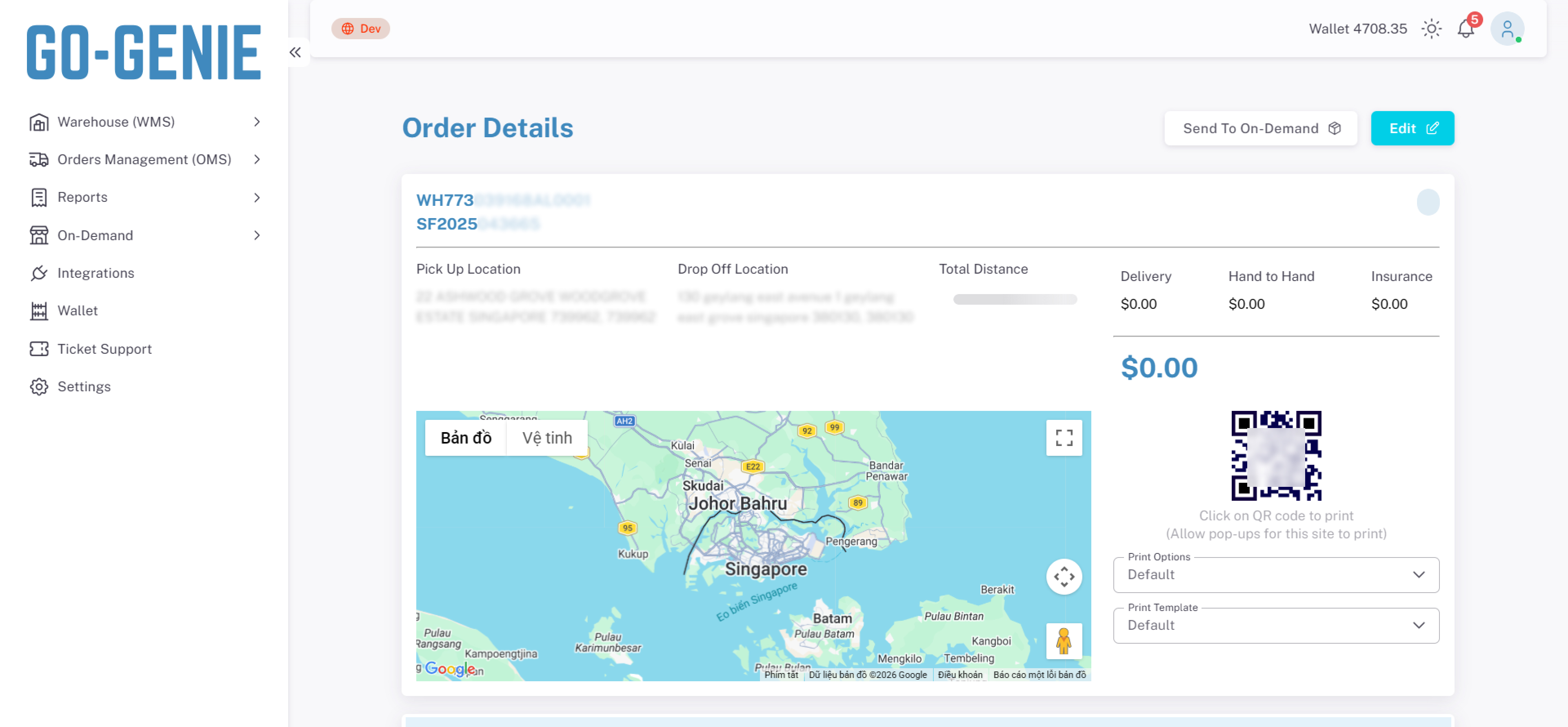
-
Every order type displays information differently. No shared structure, no consistent hierarchy. Just merchant opening a details page and having to figure it out all over again.
Users lose their mental model. When each order type looks different, there's no pattern to hold onto. Merchants can't build a habit. Every click into a details page is a small reorientation — where is the status? where is the price? where do I take action?
Mistakes become more likely. Unfamiliar layouts slow people down and increase misreads. A merchant acting on the wrong status or missing a critical field isn't a user error — it's a design failure.
The product gets harder to scale. Every new order type added without a shared structure means another layout decision, another edge case, another inconsistency. The problem doesn't stay the same size — it grows.
Challenge
This part looks simple. It just shows order information. But it took up a lot of the team's time.
When we looked at order details across different order types, we saw that too much information was being shown to merchants at once, with no clear priority. Merchants often had to stop and search just to find what they needed.
The real difficulty wasn't the display itself. It was developing a deep enough understanding of both the system and the merchant's mindset to know what truly deserved to be shown, and what didn't.
The product went through several iterations, yet none of them felt quite right. It still felt like navigating a maze.
Discovery and define
Key findings
Merchants spend so much time hunting for information that they'd rather message the support team on WhatsApp and ask them to check — than open the platform themselves.
The system exists. Nobody uses it. A bottleneck created not by missing features, but by a layout that made self-service feel harder than just asking a person.
Goals
Make it easy for new users
People should be able to find what they need without having to learn how the system works first.
Less back-and-forth on WhatsApp
Warehouse and delivery teams shouldn't have to answer the same merchant questions over and over.
Keep orders consistent
No matter the order type, merchants should always know what they're looking at.
For the future
Easily scaled up for subsequent order types (First Mile, Middle Mile).
Major solution
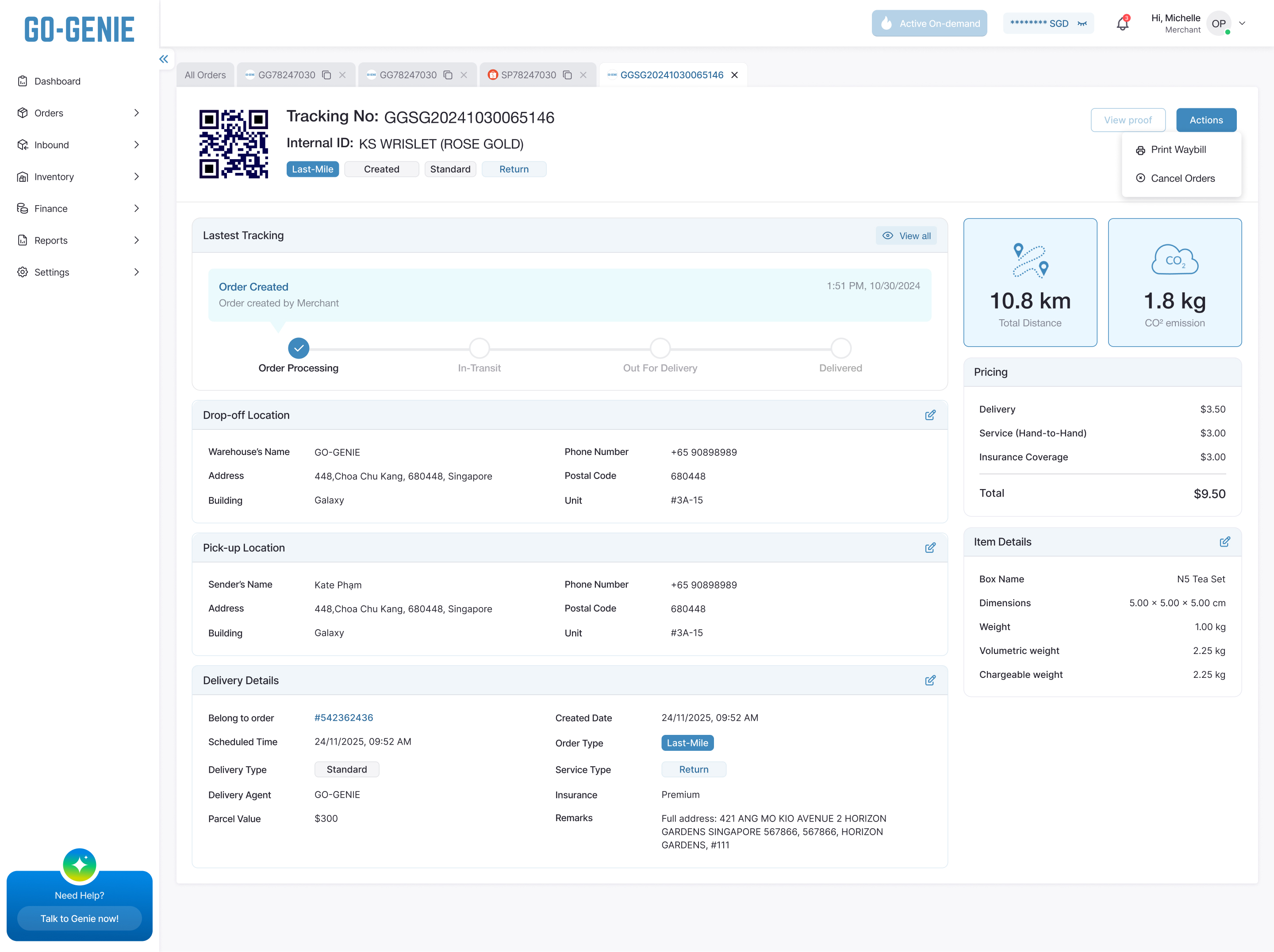
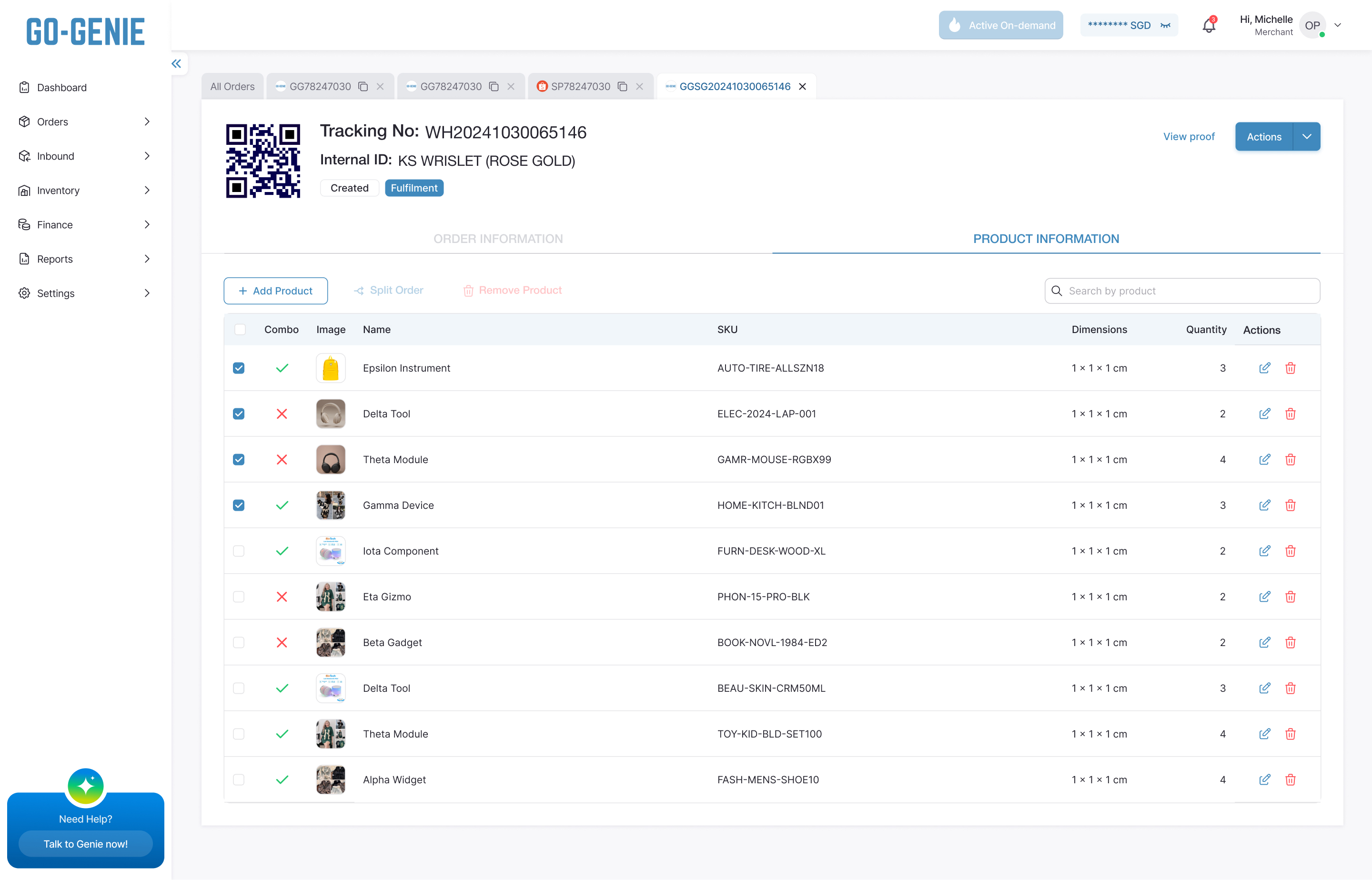
Thanks for making it this far
If something caught your eye, I'd love to talk through it
If something caught your eye, I'd love to talk through it

Every project starts with a story. I turn those stories into digital experiences that feel effortless and expressive.