Merchant Order Management System
Notes 02:
Redesigning a Unified Order Table for a Logistics Platform
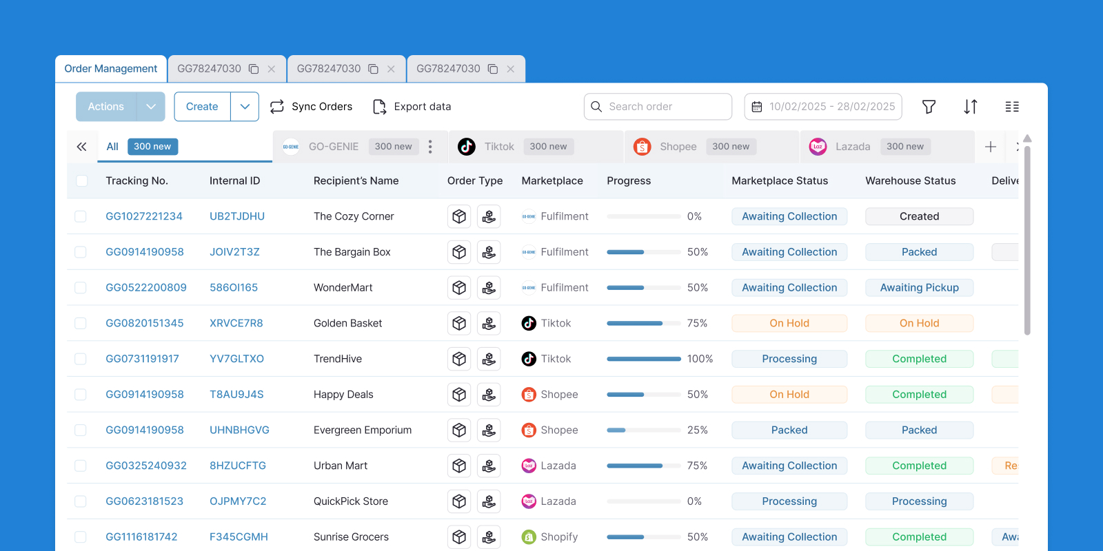
Overview
As I mentioned in the overview of the Merchant Order Management System article, this is the background of the project.
As the product evolved, new features were continuously added across sprints. Multiple order lists, fulfillment views, and product tables. While each feature worked independently, the system gradually became fragmented and difficult to navigate.
Over time, the product continued to function, but lacked overall cohesion.
The problem
When I looked into the system, I noticed that users were still able to complete tasks, but not efficiently.
Merchants started reaching out to the support team more often. The same questions kept coming in: where do I find this, how do I do that, why did this change.
The support queue grew. The team was spending more and more time walking people through a product they already knew how to use, just couldn't find their way around anymore.

A few long-term partners flagged it directly. They weren't angry, just tired. One of them had been with the platform since the early days and said something that stuck: "I feel like I have to relearn everything every few months."
That was the moment the company decided to step back and actually listen to what merchants needed.
Hmm, during those few seconds of switching between screens, could you unconsciously move your mouse cursor to the filter status of these three order types?
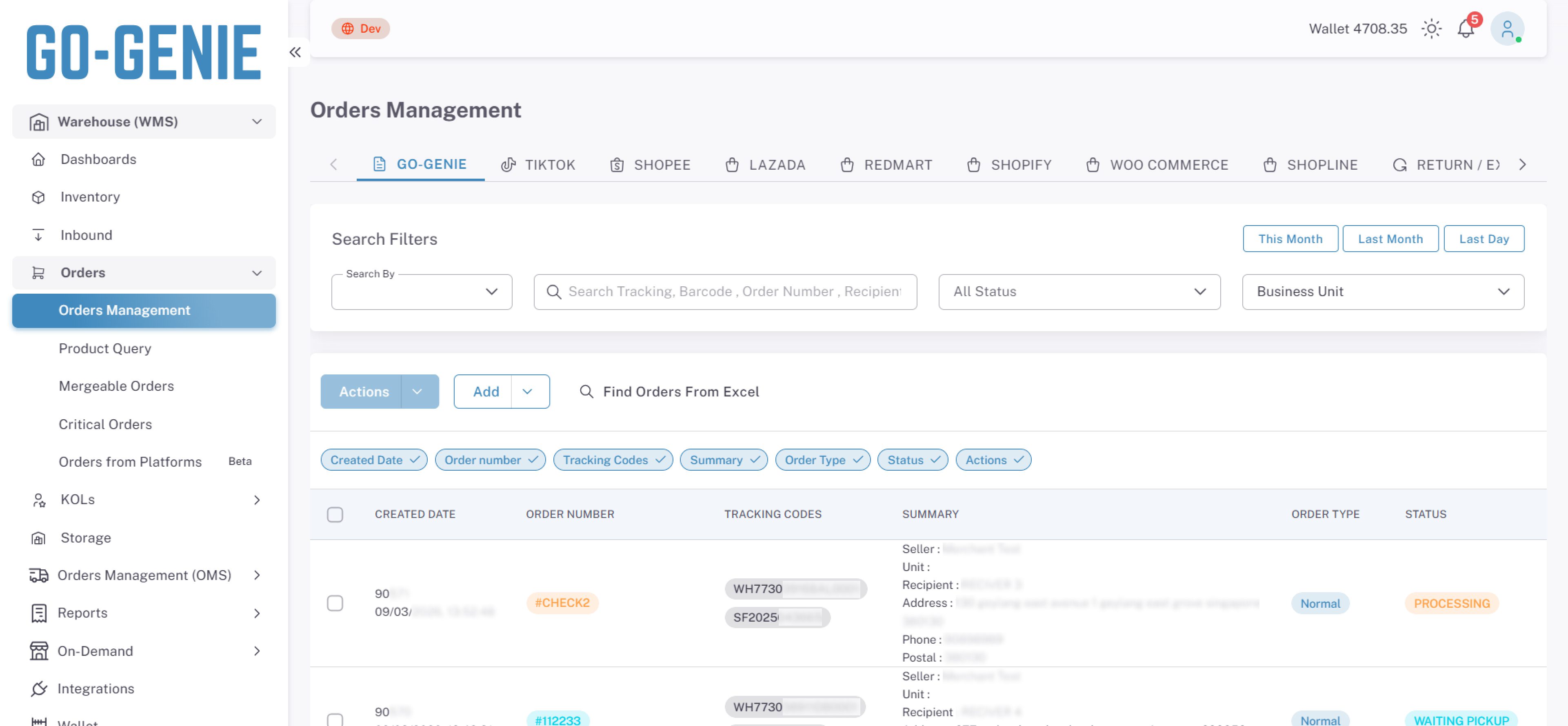
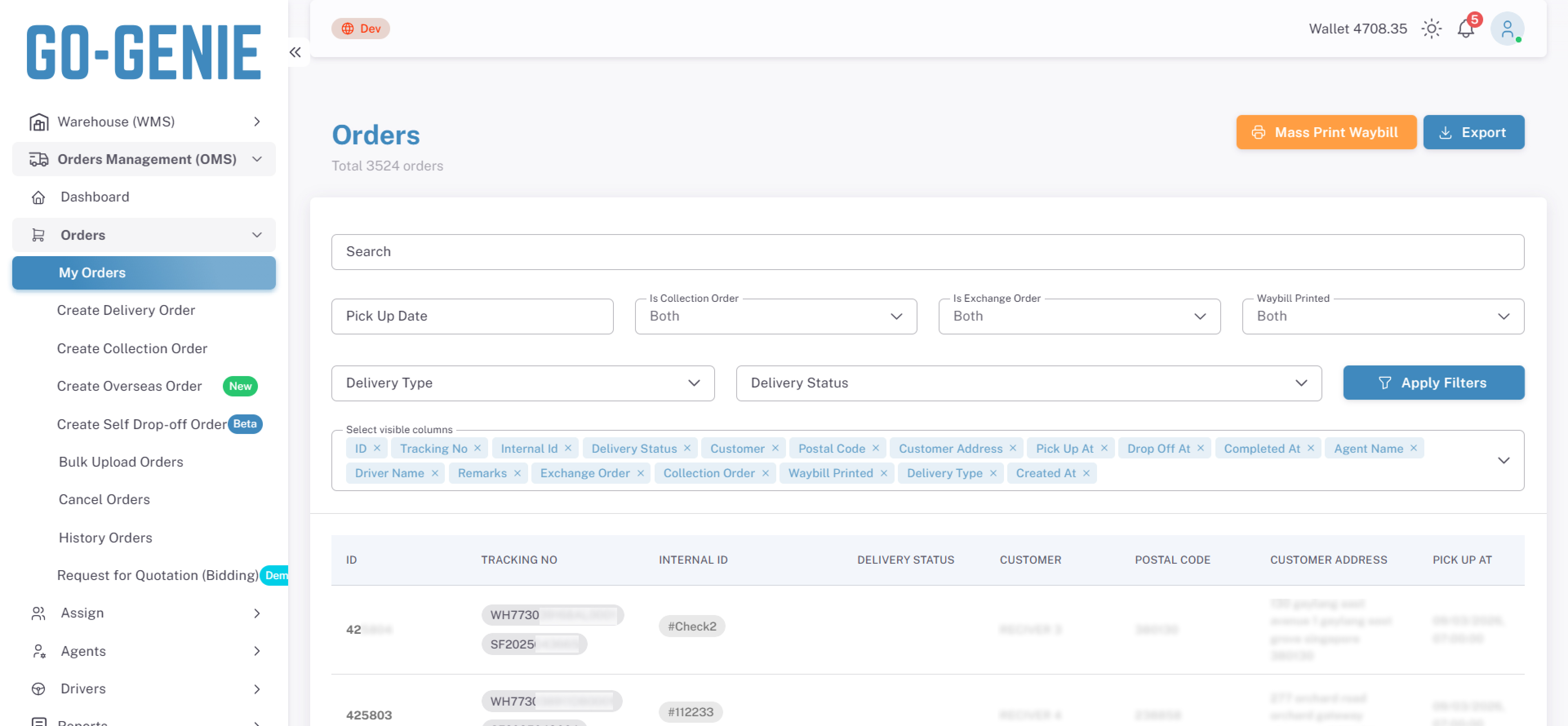

The interface provides three separate entry points to view orders, all with similar meaning which can cause confusion for users.
Discovery
Before jumping to solutions, I needed to actually understand what was happening and why.
Product Audit
Learned how the current system works by using it firsthand.
Stakeholder Interviews
Collected recurring issues from support & internal teams
Market Research
Researched competitors such as Qian Yi, Locab, and EasyParcel.
Key Insights
Merchants had stopped trusting the interface.
Not because they didn't understand the product, but because the interface kept making them second-guess themselves. Every session came with small moments of doubt that added up to a workday that felt harder than it needed to be.
No consistent spatial memory
Layout variations across tables prevented users from forming a stable mental model. Each session required reorientation before productive work could begin.
Tables contained too many action buttons, requiring users to recall which one to select for each task rather than recognizing it on sight.
Status change indicators were unclear, leading users to reload the page to confirm whether an action had taken effect.
Merchants defaulted to WhatsApp instead of using the interface
The feature existed, but the cognitive cost of locating and using it exceeded the cost of contacting support directly.
Support staff could not predict interface behavior
Support agents were unable to guide merchants because they could not reliably locate features themselves. This is a learnability failure.
The interface lacked enough consistency for indirect users to build an accurate mental model of it.
The interface lacked enough consistency for indirect users to build an accurate mental model of it.
No shared UI rules across developers
Each feature was built independently without a common set of interface guidelines. The result was a product that lacked visual and interaction consistency, even though no individual component was objectively wrong.
Goals In My Scope
Merchant (User)

Standardize layout structure across views to support spatial memory and reduce reorientation cost per session.
Reduce cognitive load per table row. Consolidate action buttons, expose secondary actions via overflow menu.
Provide immediate system feedback on status changes to eliminate the need for manual page reload as a confirmation mechanism.
Support team
Establish consistent information architecture so agents can predict feature location without direct product usage.
Reduce inbound volume driven by interface confusion through improved learnability and self-service clarity.
Dev team
Define a shared component library and interaction pattern library as the single source of truth for all UI development.
Establish UI guidelines as a required reference at the start of every feature build — not a post-hoc review.
Overview Solution
Redesigned the table system into a single, consistent foundation across all order views. The solution focuses on three key shifts:
Unify structure → One table pattern for all order types
Standardize interactions → Clear rules for actions and controls
Improve state visibility → Users always know what’s happening
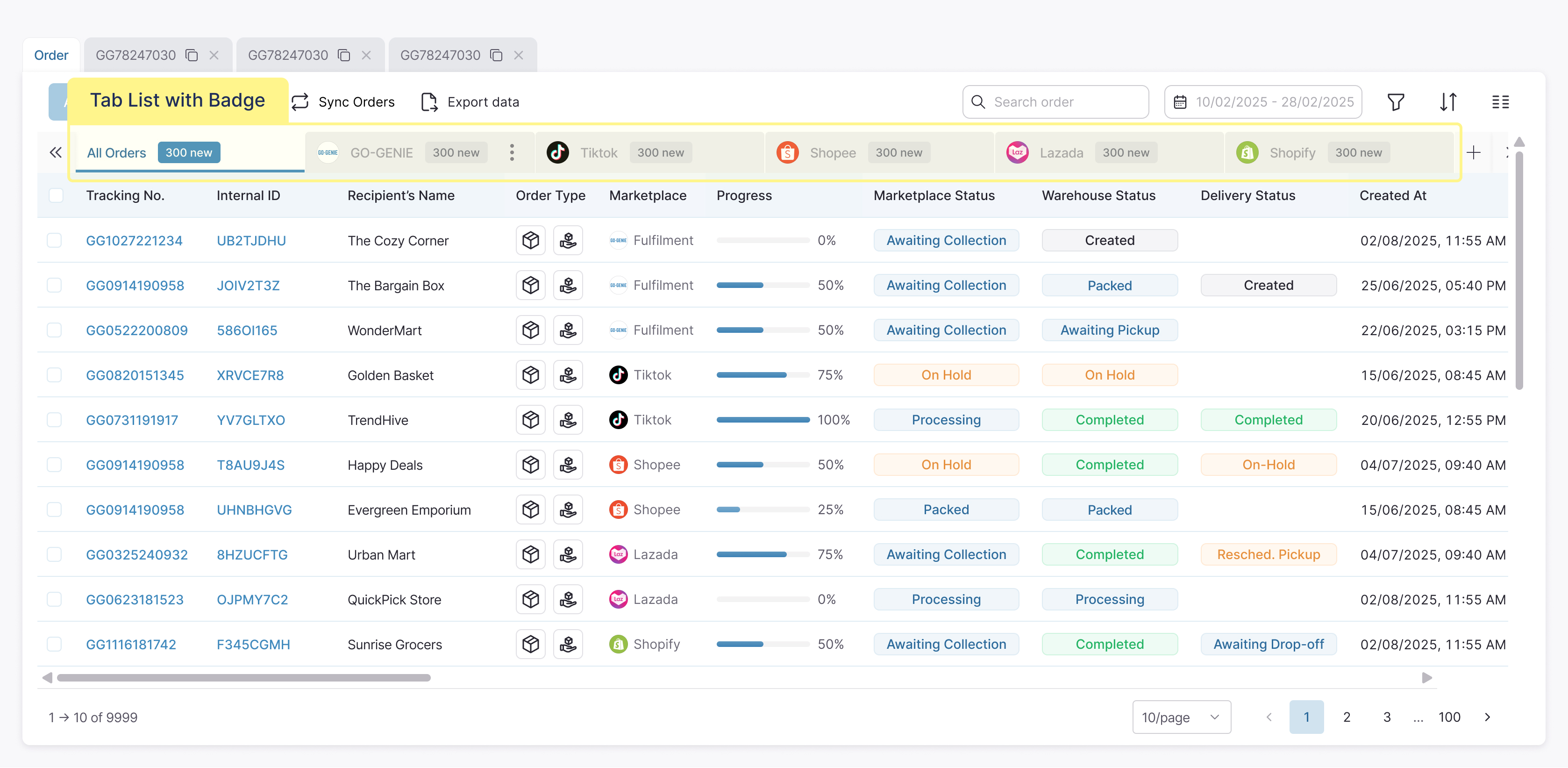
1. Unified and optimized table for data review
I redesigned the table as a shared foundation across the system.
Instead of separate table patterns for each feature, I introduced a unified structure:
01
Each row represents a single order record
02
Differences between order types are represented through structured attributes such as order type, channel, and status
To support both usability and flexibility, I defined two levels of data visibility:
Default View
Displays essential information required for daily operations, including tracking number, recipient, order type, marketplace, and status.
Customizable View
Allows users to configure additional columns based on their specific workflow requirements
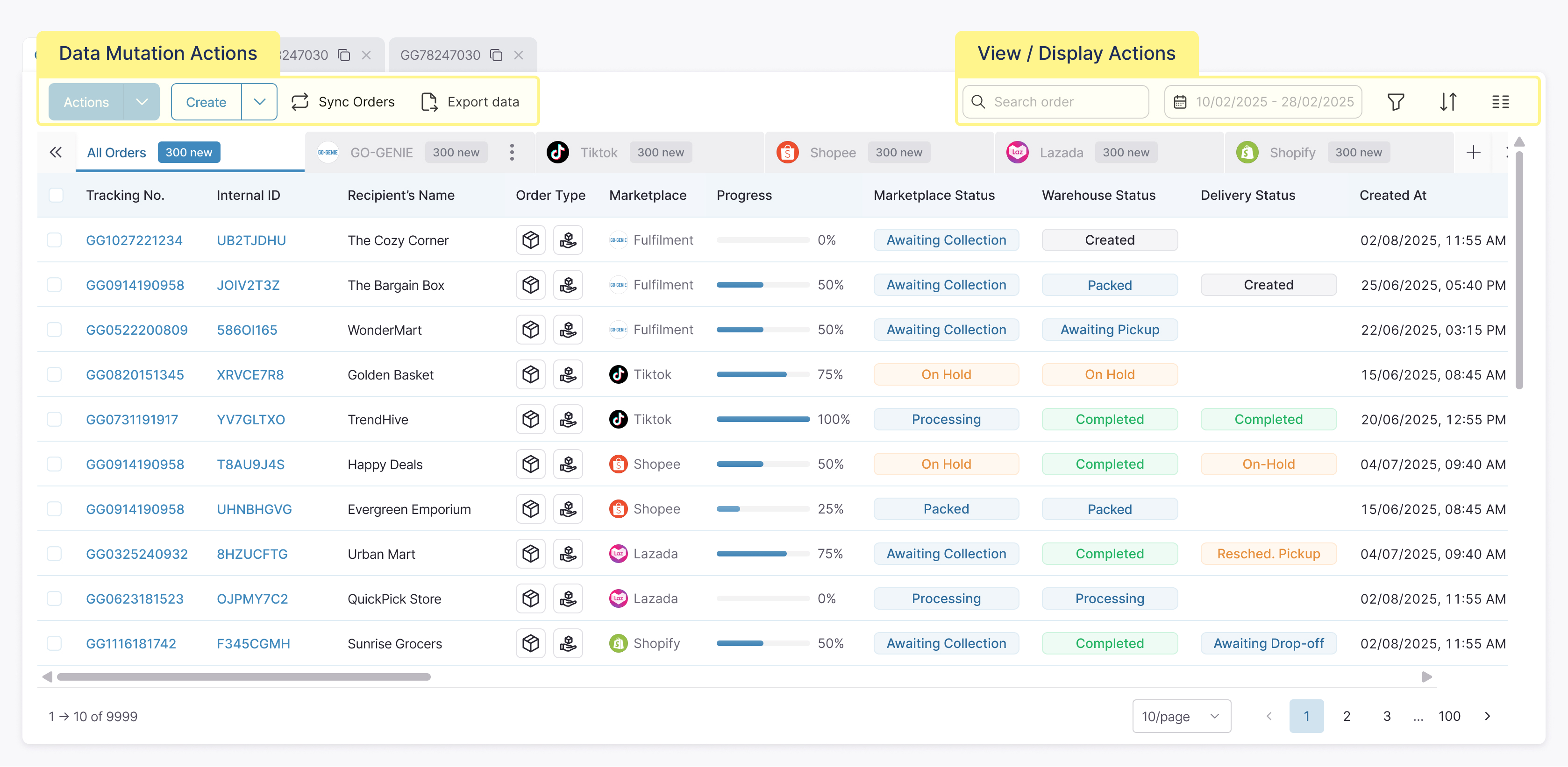
2. Standardized interaction patterns (reduce cognitive load)
Initially, the table contained a large number of actions placed together without a clear structure. Merchants had to read through multiple buttons to understand what each one does before taking action.
I approached this by breaking down all existing actions and reorganizing them based on their purpose.
First, I identified two main categories:
Actions that change data
These actions directly affect orders, such as creating, syncing, or exporting
Actions that change the view
These actions only control how data is displayed, such as searching, filtering, or sorting
I then applied a consistent rule:
Data-related actions are placed on the left
View-related actions are placed on the right
3. Table Control and State Visibility for Large Data Handling
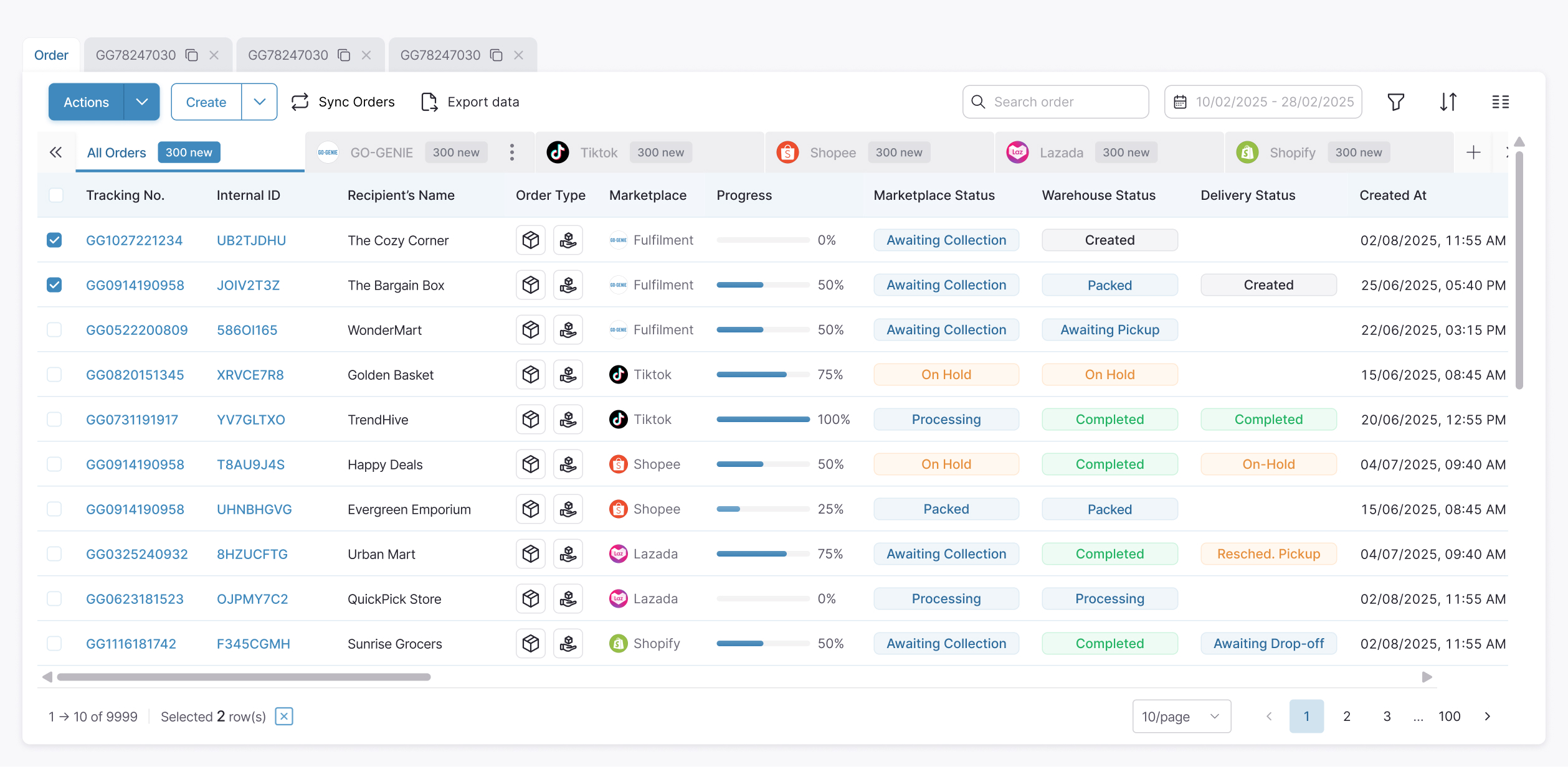
For row selection:
01
Checkbox selection is enabled for individual and multiple rows
02
The number of selected items is displayed clearly
03
Selection states can be easily reset or updated
For row selection:
01
Actions can be applied to multiple selected rows
02
The system reflects selection state consistently
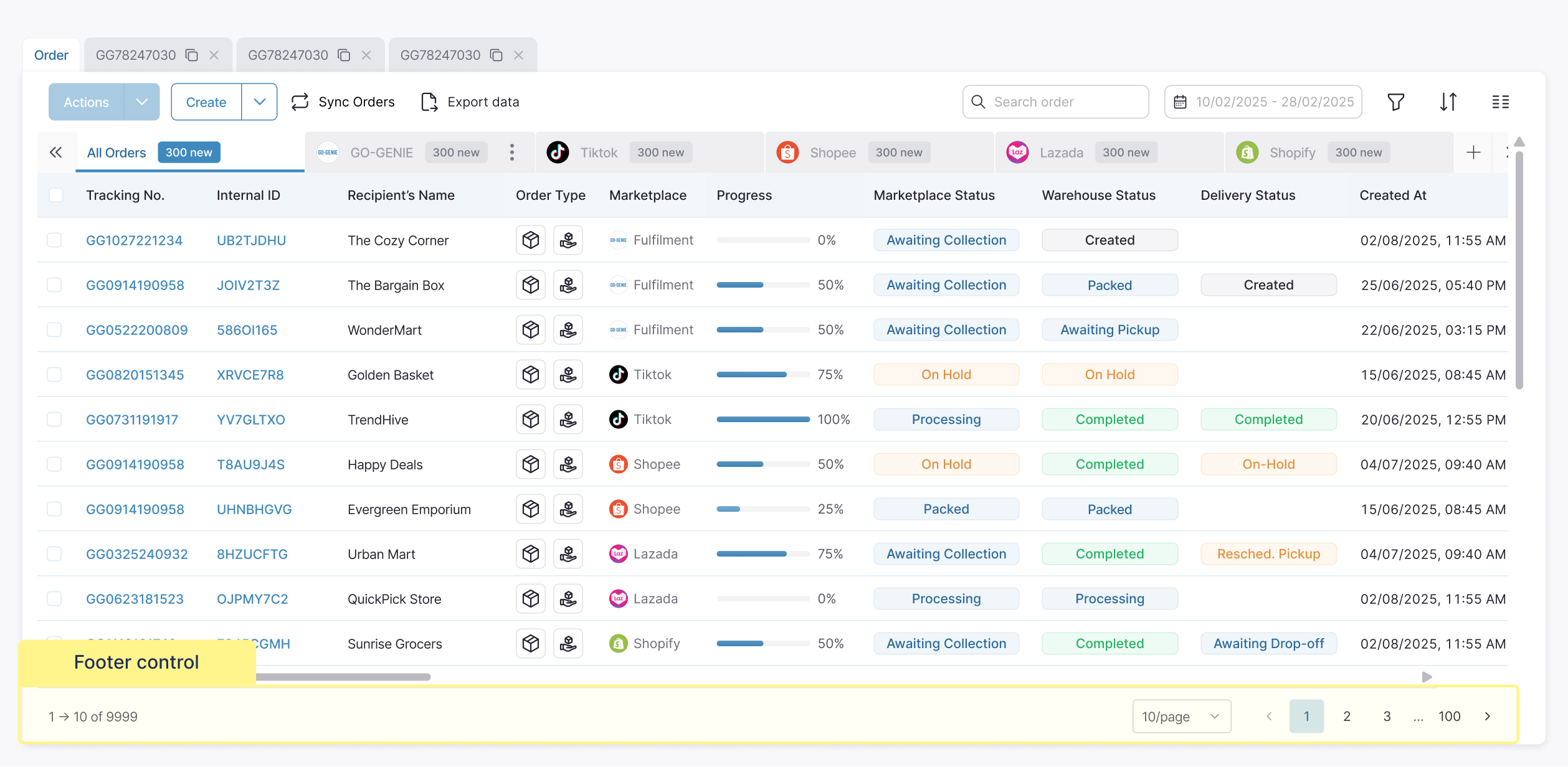
For table navigation and density control:
01
Pagination is implemented for navigating large datasets
02
Users can adjust the number of rows displayed per page
Reflection
The issue wasn’t that the system lacked features. It lacked consistency.
Designing a table isn’t about showing data. It’s about helping users quickly understand what matters and what to do next.
Thanks for making it this far
If something caught your eye, I'd love to talk through it
If something caught your eye, I'd love to talk through it


Every project starts with a story. I turn those stories into digital experiences that feel effortless and expressive.