Merchant Order Management System
Notes 01: Navigation is not access. It’s orientation.

"Navigation isn't a sidebar. It's the skeleton everything else is built on, and when it's done right, the product can grow without breaking."
Navigation is always the first thing I think about when starting any project. It answers the three questions every user silently asks:
Where am I? Where can I go? How do I get back?
When it's designed well, users feel oriented and in control. When it's not, even the best features go undiscovered. That's why I treat navigation as the foundation everything else is built on, not decoration, but the backbone of the whole experience.
Overview
In the old website, everything was compressed into the sidebar. Every "important" feature, all in the name of one-click access (and every feature is important to them).
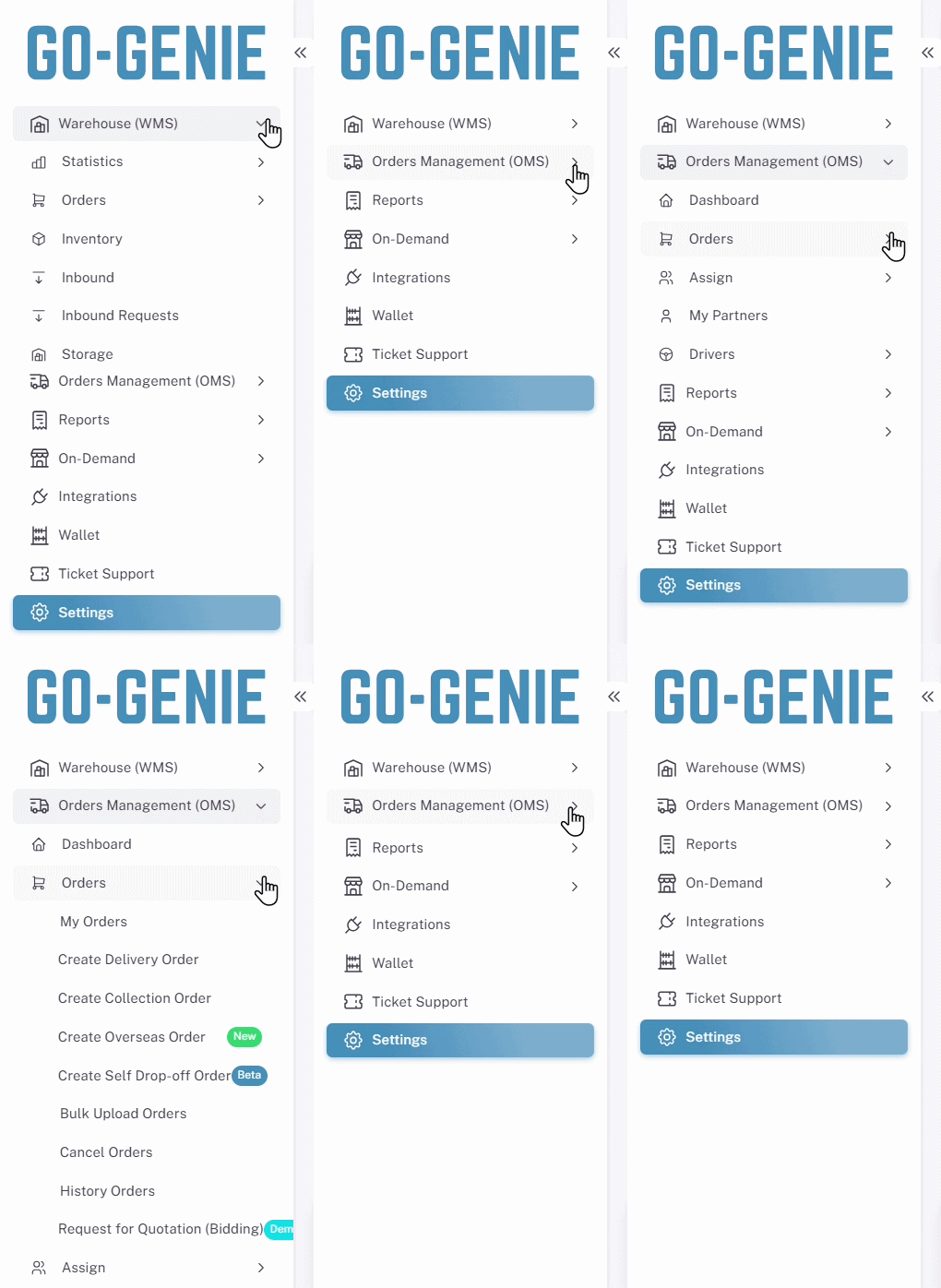
(👁️👄👁️)
This is truly the reaction of me and other people who are just starting to use MVP websites.
Perhaps the only advantage is that merchants can always rest assured that the feature is always located in the sidebar.
And the rest will be moments of thinking about what to click and times of clicking by mistake.
Because all the features are in the sidebar, the screen structure lacks depth and is almost "independent," with no apparent connection between the previous and current pages.
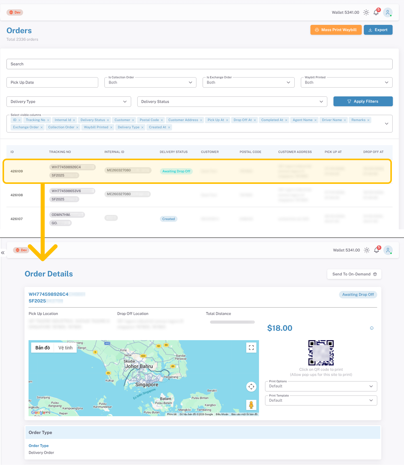
No "Back" button, no breadcrumbfree
With no breadcrumbs and no sense of location, merchants had no way of knowing where they were in the system. Some actions would even open a new browser tab, making them lose the page they were just on.
It felt like being lost in a maze. Every step forward just added more walls behind you.
Discovery
Before jumping to solutions, I needed to understand what was actually breaking and for whom.
Product Audit
Learned how the current system works by using it firsthand.
Market & Competitor Research
Researched competitors such as Qian Yi, Locab, and EasyParcel.
Stakeholder Interviews
Spoke with team members who collect feedback from key clients to understand common user needs and challenges.
The insight
01
Merchants handle 100–500 orders a day across Last-mile, Fulfilment, On-demand, International, but each type lives in a separate sidebar section. Switching between sections to create or find orders wastes time that should be spent on actual work.
02
Merchants sometimes get last-minute pickup requests and aren't ready when the driver arrives. On top of that, they have no easy way to track order status in real time.
03
For most orders that need to be canceled or are pending, merchants will contact them directly via WhatsApp for support because they don't want to use website.
04
From the business side, separating features by type makes it easier to control access and sell them as add-ons. This gives merchants the flexibility to scale up as their needs grow.
Goals
Helps users understand where they are within the system flows.
Highlights key and essential features so users can complete their daily tasks easily.
Meets business requirements by encouraging the use of paid features.
Solutions
After months of studying how merchants actually operate. Watching how they switch between orders, where their eyes go first during a busy shift, what causes them to lose time. I arrived at this final layout. It's not our first attempt. It's the result of iteration, merchant feedback, and a clear design principle: every element on screen must earn its place.
I redesigned the navigation into a 3-layer system:
Sidebar → business structure
Top bar → critical signals
Tabs → parallel workflows
This reduces cognitive load while keeping the system scalable.
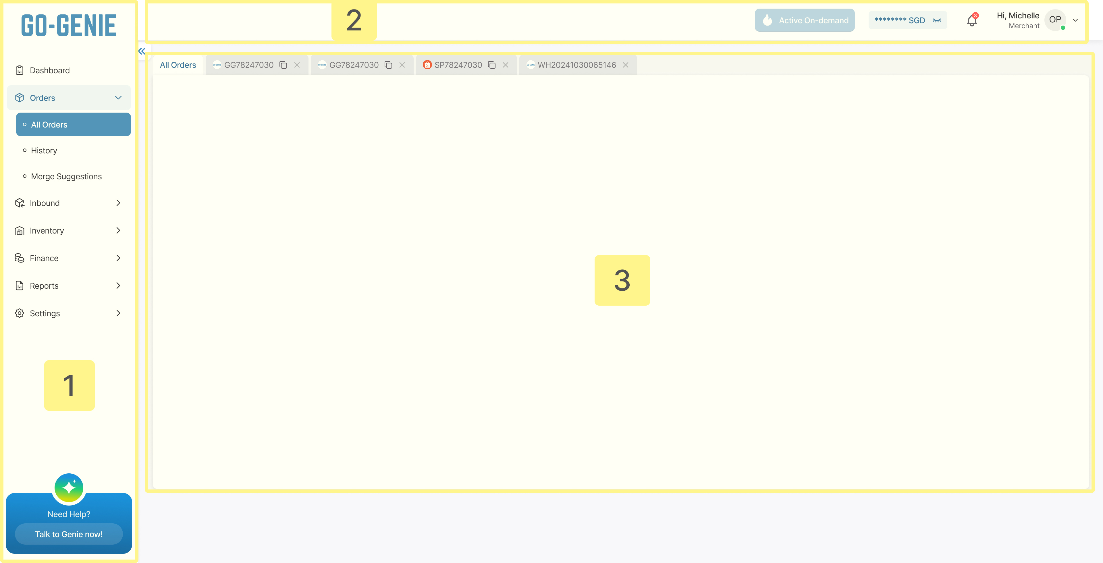
The highlighted sections are the navigation definitions I need to know in order to effectively support the merchant.
Quite surprising, isn't it? Because navigation is always present in everything.
Layer 1 : Sidebar - Business structure
After researching with Product Manager, I found that merchants naturally think in terms of business areas, not features. So I built the sidebar around that. Each section maps directly to what merchants actually want to do:
How is my business performing?
Manage or do things with my orders
Receiving new stock?
Checking what's in the warehouse?
Looking at bills or payments?
Need data or reports?
Changing system settings?
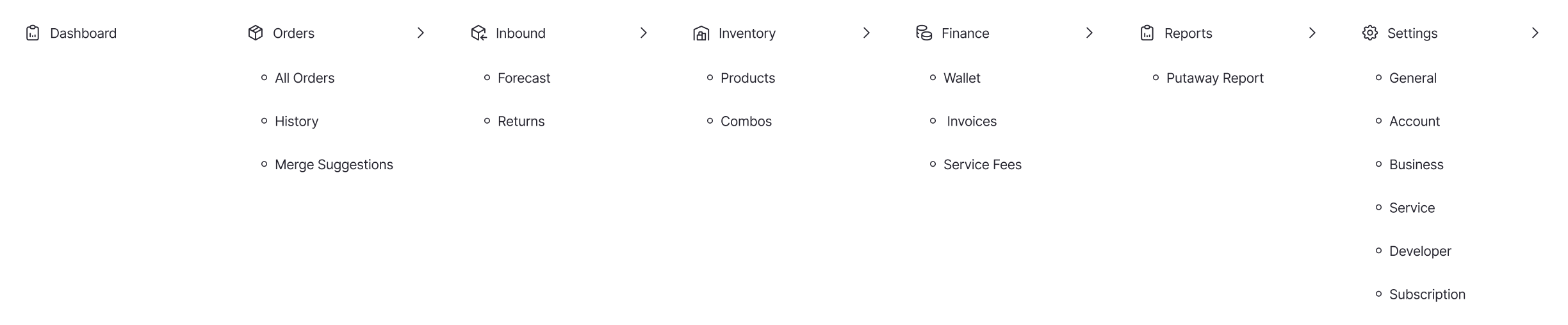
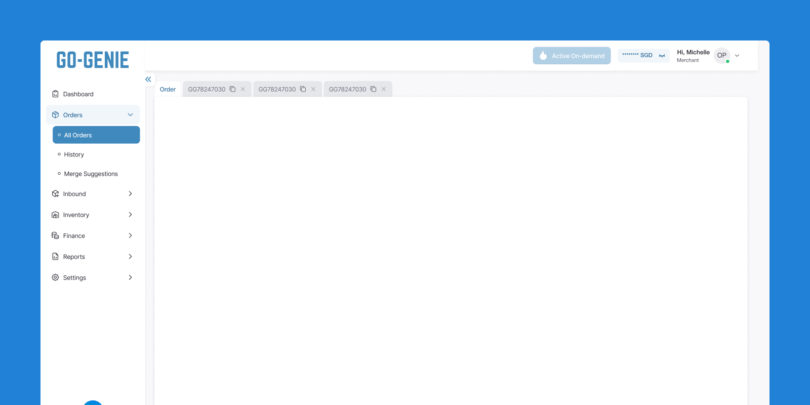
The sidebar in action, clean, grouped by business area, and only showing what the merchant actually needs.
This structure also aligns with GO-GENIE's available services. If a merchant doesn't use storage or fulfillment, inbound or inventory are simply hidden. Keeping the system clean and adaptable to different needs.
Layer 2 : Top nav - Real-time priorities (What needs attention?)

The top navigation is reserved for the most important and instantly recognizable information.
For merchants, that comes down to two things. The remaining balance in their wallet, and the number of orders currently waiting for a driver pickup.
Layer 3 : Tab bar - Parallel workflows
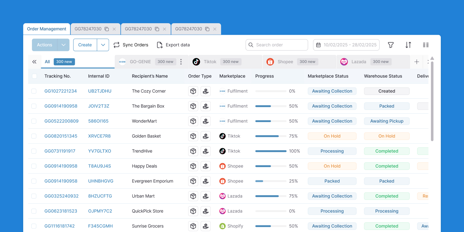
Tabs are grouped by business domain, and the Overview tab is always pinned in place. So no matter how deep merchants go, they can always find their way back.
Instead of jumping between browser tabs and losing track, merchants can handle everything within a tab-based system inside each main section.
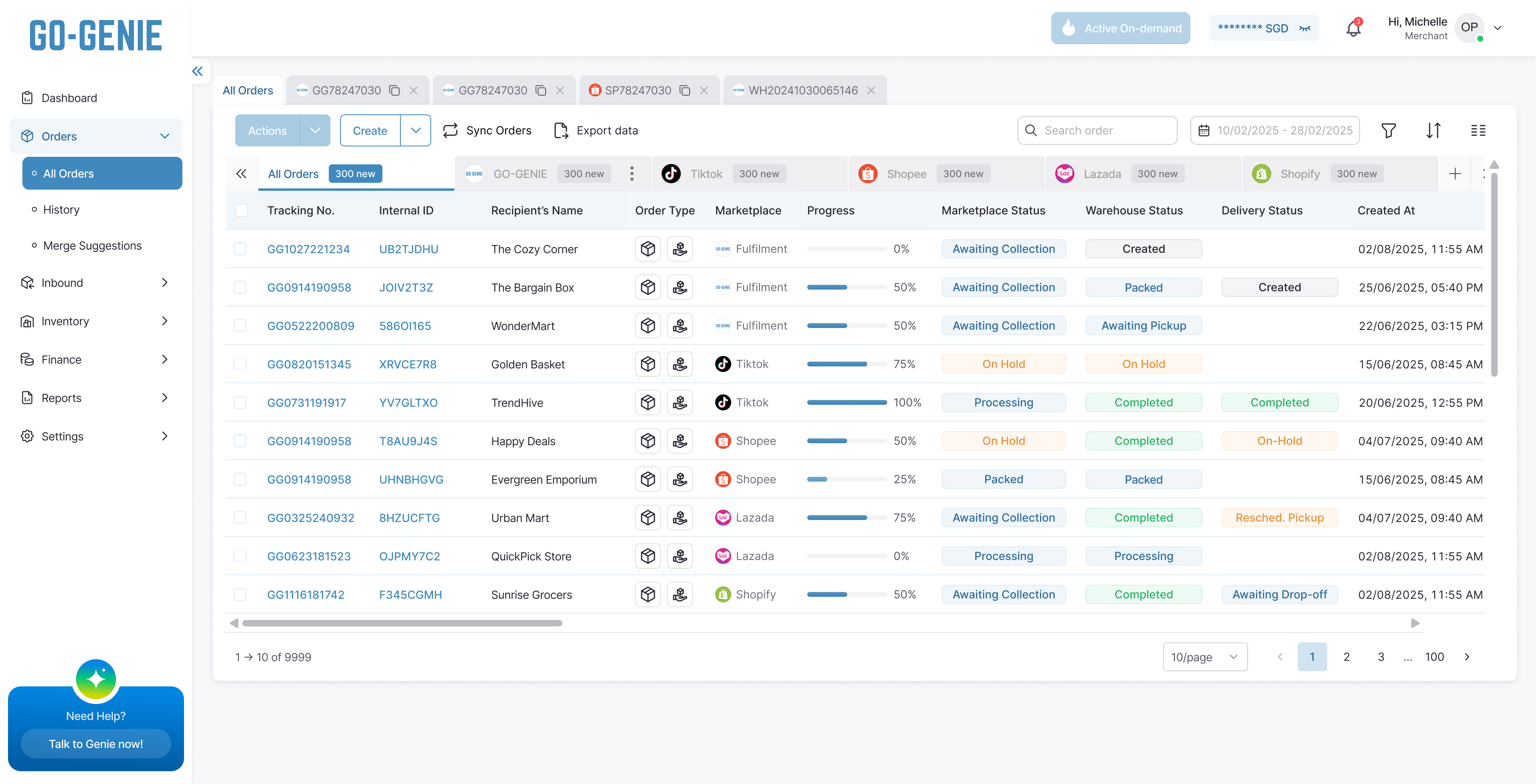
Tabs keep everything in one place, no browser tab switching, no lost context, just smooth navigation from one task to the next.
Reflection
Looking back, the biggest shift wasn't visual. It was conceptual.
Navigation isn't a UI component you add at the end. It's a reflection of how your users think, and if it doesn't match their mental model, no amount of polish will fix the confusion underneath.
The sidebar was never the problem. The problem was treating navigation as a list of features instead of a map of how merchants do their work.
Thanks for making it this far
If something caught your eye, I'd love to talk through it
If something caught your eye, I'd love to talk through it


Every project starts with a story. I turn those stories into digital experiences that feel effortless and expressive.