From UI Kits to a Scalable Logistics Design System
How I built a 300+ component design system from scratch and why it changed the way the entire team ships product.
Role
Product Designer
Team
Kate Pham & Kim Phan
Duration
Feb 2025 – Oct 2025
Status
Released
🔎
Context
GO-GENIE, a Singapore-based logistics SaaS scaling fast across mobile, web, and multiple product lines
💡
Contribution
Co-proposed and built the design system end-to-end: tokens, components, documentation across mobile and web
🎉
Impact

Unified the design language across Merchant, Driver, Warehouse, HRM, CRM, and Admin products.
Enabled faster mobile launches for the Cambodia and China markets.
Established a scalable foundation for the Web V2 redesign.
How I got here
I joined GO-GENIE as a Mobile UI Designer, designing the warehouse app used for daily pick-and-pack operations. As the company grew, I expanded into the merchant platform and later contributed to the driver, warehouse, and admin products.
Working across multiple products gave me a clear view of the problem. Every team maintained its own UI library and design decisions. As the ecosystem expanded, inconsistencies grew with every release.
"There was no single source of truth. Every team was working from its own version of the visual language, and the gap between them kept growing."
The moment it became a problem
At the time, GO-GENIE didn't have a Design System. Mobile and web each had their own UI library, and both evolved independently.
When Kim joined the web side, we quickly realized the gap. The same components looked and behaved differently, handoffs took longer, and keeping products consistent became harder with every release.
"Two designers, two kits, two codebases. Nothing was technically wrong, but nothing was connected either."
Instead of maintaining separate libraries, we decided to build one shared Design System for every product.
How we built it?
I started with the mobile app instead of the web platform. It had fewer screens and a smaller user base, making it a lower-risk place to test and refine the Design System before scaling it across other products.
Phase 01
Audit everything
I reviewed every live screen across the platform. The audit uncovered 9 button variants, 6 input styles, and inconsistent color usage across products.
Phase 02
Define the language
Before creating components, I established design tokens for color, typography, spacing, radius, and elevation. These became the shared foundation for both Figma and the frontend library.
Phase 03
Build components in parallel
I built each component in Figma with every state and variant documented. The FE engineer built the corresponding code component the same week. Inconsistencies got caught before they shipped.
Phase 04
Document, then expand
Each component had usage guidelines: when to use it, when not to, what it combines with. Without this, people just pick whatever looks right and the system drifts.
What is it really like?
The Design System was built from the ground up, starting with design tokens and evolving into reusable components and production-ready templates. This foundation helped the team build faster while keeping the experience consistent across multiple logistics products.
Design Token Architecture
Variables were organized into primitive, semantic, and component-level collections. This made colors, typography, spacing, and themes reusable across the entire system.
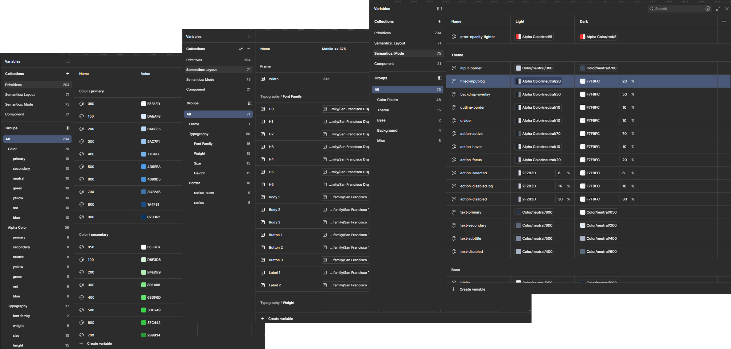
Design Token Architecture
Component Architecture
Components followed Atomic Design principles, progressing from atoms to templates. A clear structure reduced duplication, improved discoverability, and made the library easier to maintain.
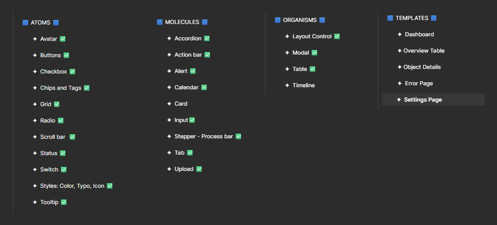
Component Architecture
From Components to Real Products
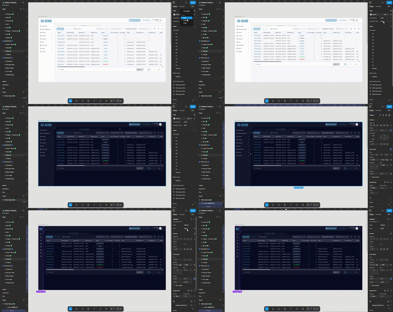
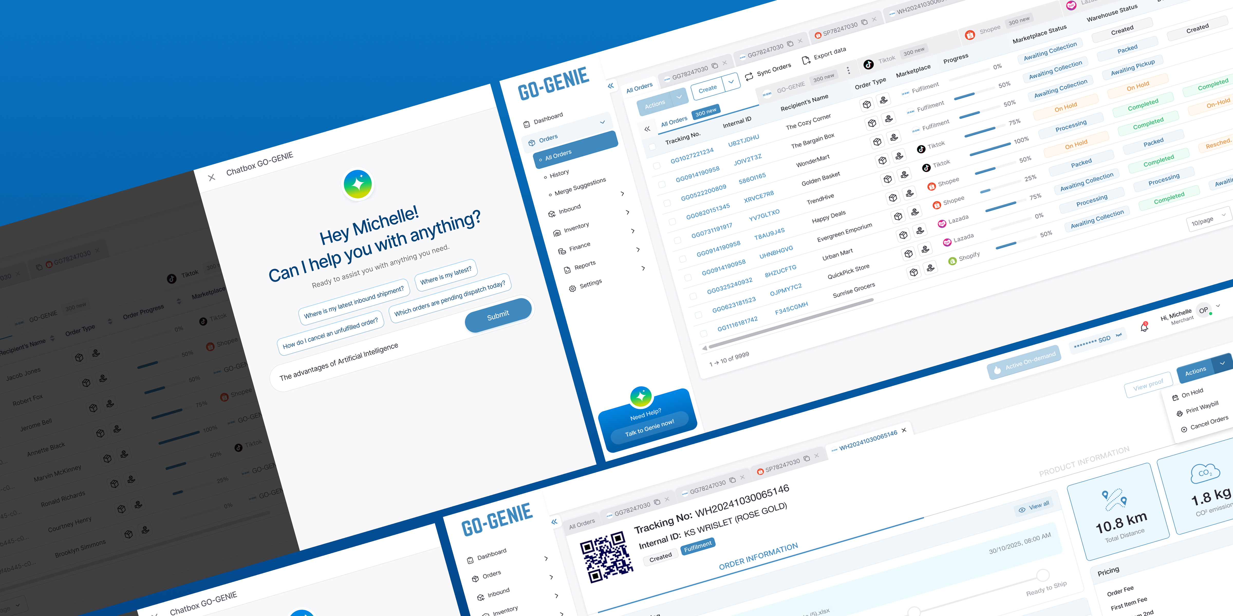
The Design System was applied directly to real products. Reusable templates and components allowed new pages to be assembled quickly instead of designing each screen from scratch.
🚨 A problem that came up mid-build 🚨
About three months into the project, the Figma library and frontend library fell out of sync. I updated components in Figma, while developers continued building with an older version.
The mismatch caused confusion, delayed development, and turned a quick review into two days of rework.
From that point on, I focused on improving the handoff process with two simple changes that kept the design and frontend libraries in sync.
📌
Ready for Dev Workspace
Every UI update was documented in a dedicated Figma file. Developers could quickly see what changed, when it changed, and which screens needed implementation without searching through the Design System.
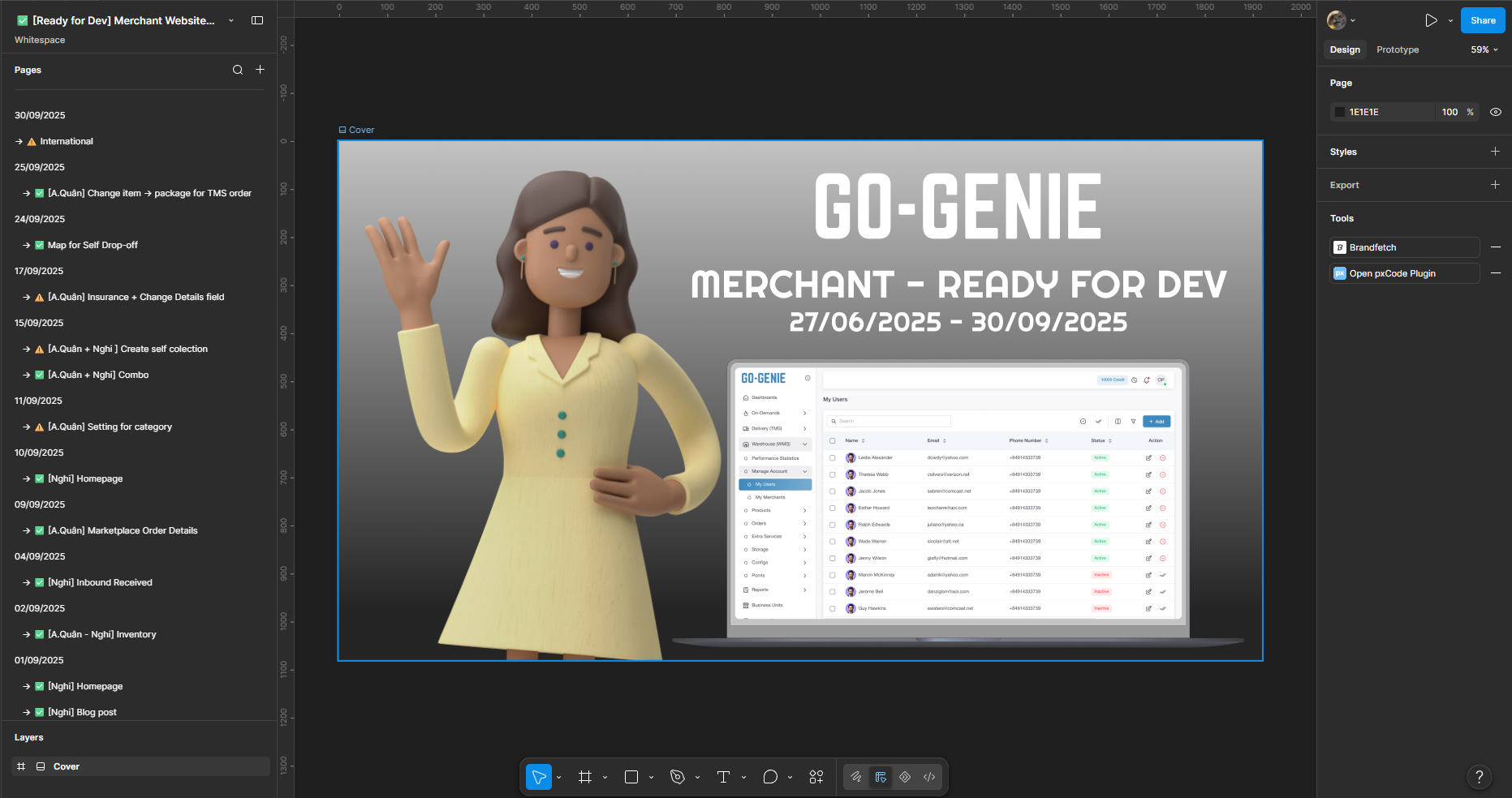
Effectiveness: ⭐⭐⭐⭐⭐
Comment: Every UI update was tracked in the "Ready for Dev" workspace. The Design System library was only published after the corresponding frontend components had been implemented, ensuring projects always used components that matched the code.
📌
A weekly sync
20 minutes every Tuesday between me and the FE engineer to flag what was changing and what needed catching up
Effectiveness: ⭐⭐⭐
Comment: It reduced surprises, but we still needed a clearer way to know which components were production-ready.
What changed, in practice
After running the mobile system internally for a while, the real test came when GO-GENIE moved into new markets. Here are four moments where having a system made a visible difference.
01. Launching freight booking products in Cambodia and China
BEFORE
Every new product screen started from scratch. Decisions about layout, components, and states had to be made fresh, then handed off to dev who rebuilt the same things in code.
✨ AFTER ✨
With the system in place, the full cycle from ideation to UI to dev handoff moved significantly faster. Components were already defined and tested. Both sides knew exactly what to build from.
02. A brand color update that did not break everything
BEFORE
Color was spread across files with no single reference. A change meant hunting every button, badge, and header manually and still risked missing something.
✨ AFTER ✨
Updating the primary color meant changing one token. It cascaded through every component in Figma automatically. The same change on the code side touched one variable. Done in under an hour across the full product.
03. A new engineer onboarding without a design walkthrough
BEFORE
New devs relied on existing code as a reference, which sometimes reflected outdated decisions. Questions kept coming back to the designer, slowing both sides down.
✨ AFTER ✨
The new engineer was pointed to the component library on day one. States, usage rules, and interaction guidelines were all documented. The first feature shipped matched the design without a revision round.
04. Building web v2: one brand, all products
BEFORE
Mobile and web had separate visual languages. The platform felt like different products depending on which surface you were using. Hard to maintain, harder to scale.
✨ AFTER ✨
After being promoted to Product Designer, I extended the system to web, bringing both surfaces onto the same token base and component patterns. Web v2 was the first time mobile and web genuinely felt like one product.
What I'd tell someone starting this
No wireframes
UI design went straight to high-fidelity. Components were already there, just compose, not create.
300+
Components covering merchant, driver, HRM, and CRM, all from one shared token base
Faster dev
Engineers pulled from the library instead of rebuilding. New features meant assembling, not reinventing.
Easier to maintain
Updating a token cascades everywhere. A color change that used to touch 40 screens now touches one file.
Onboarding got easier too
New product hires could orient themselves with the system. Instead of asking "why does this button look different," they had a reference that answered it before they asked.
Reflection
Don't wait until the system is perfect to use it. The system only gets useful by being used. Ship a small version, get it into real hands, and fix what breaks in practice.
The biggest risk isn't building the wrong components. It's building components nobody syncs on. Get a developer involved from day one, not after you've built 200 things in Figma alone.
And document the "why," not just the "what." Telling a designer "use this button variant" is less sticky than telling them "use this button when the action is destructive, because the visual weight signals consequence." They'll remember the reasoning and make better calls on the edge cases you didn't write a rule for.
More Projects

Every project starts with a story. I turn those stories into digital experiences that feel effortless and expressive.